


I run a business, not a coding lab. I need pages that sell, load fast, and look like a pro touched every pixel—without waiting on a dev queue or burning cash on custom builds. After shipping more sites than I can count, I’ve boiled launch down to a simple system. It’s fast, repeatable, and good enough to win real clients on day one.
Below is the exact playbook I use when I need a client-ready website in days, not months.
Start with a one-page brief (and hold the line on scope)
Skip the mood boards and endless meetings. Write a one-page brief that answers five blunt questions:
- Who is this for? Name the audience and the main pain they feel.
- What do I want them to do? Book a call, start a trial, request a quote—pick one primary action.
- What proof do I have? Two short case notes, one testimonial with a real name, and at least one result (percent, time saved, revenue gained).
- What pages ship first? Home, Offer/Services or Product, About, Pricing, Contact. That’s enough to sell.
- What voice am I using? Three words. Mine: clear, practical, confident.
This brief is the guardrail. Every request that doesn’t help the primary action goes to a backlog. Launch with less; sell more.
Build a small visual system once
A consistent system beats a flashy one-off. I set four rules and stick to them:
- Color: one primary, one neutral, one accent.
- Type: one headline family, one body family; fixed sizes for H1–H3 and body.
- Spacing: an 8-point scale. No random gaps, no sloppy stacking.
- Blocks: a hero, a feature row, a testimonial, a pricing table, and an FAQ.
I design these blocks once, then drop them across pages. This is how the site feels “custom” without a custom build. Consistency creates the polish people pay attention to.
Choose a base template that won’t fight you
Trendy doesn’t help. Fit does. I run a 30-minute test with my real copy and images:
- Structure fit: Does it support the five core pages and the blocks above?
- Editing: Can I set colors, type, and spacing without digging in code?
- Mobile: Menu works, images crop well, text is readable, tap targets are wide.
- Speed: Replace the demo content with real text and photos; still snappy?
- CMS: Can I add a simple blog or case study later without surgery?
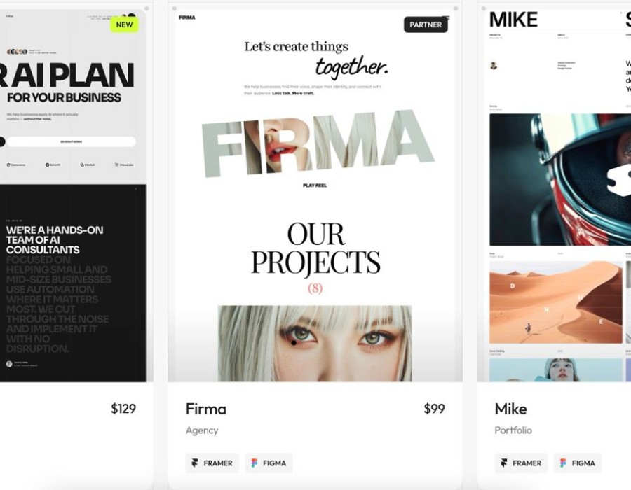
If the hero layout breaks the second I paste real copy, I move on. A good base shortens decisions and removes guesswork. Around the middle of my build, if I want a reliable source for templates that pass these checks, I’ll browse https://templifica.com/ and filter by layout type and use case. The right starting point saves hours and avoids the “looks great in the demo, collapses in real life” trap.
Write the page that sells (Home), then echo the pattern
Most sites fail at the first scroll. Here’s the format I use to write a Home page that converts, line by line:
Hero
- Headline: Who you help + the outcome. Keep it one line.
- Subhead: Add a clear, concrete promise or method.
- Primary CTA: One button that matches the action in your brief.
- Social proof: Trusted logos or a short quote with a name and role.
Problem → Outcome
State the pain in plain words, not jargon. Then paint the after-state: less time wasted, a cleaner process, a result you can measure.
How it works
Three to five steps. Short, active verbs. No fluff. Show the path to the result.
Features → Benefits
For each feature, write the benefit first. Example: “Prebuilt page blocks—ship new pages in minutes.”
Evidence
A short case card: client, challenge, action, outcome. Numbers beat adjectives.
Offer + Pricing
Say what’s included and what isn’t. If you have multiple plans, highlight the one most buyers choose. Add a guarantee if you can stand behind it.
FAQ
Answer the budget, timeline, and risk questions you always hear on calls.
Once the Home page is tight, echo this pattern on “Services/Offer,” “About,” and “Pricing.” You’ll move faster because the decisions are done.
Ship-level SEO and performance (no rabbit holes)
I’m not chasing every keyword at launch. I’m making the site findable and fast.
On-page basics
- One H1 that matches the page’s intent.
- Title tags under ~60 characters, written like a clear sentence.
- Meta descriptions around ~155 characters with a verb and benefit.
- Descriptive slugs:
/pricing,/case-study/brand-x. - Alt text that explains the image, not a keyword dump.
Internal links
Point from high-traffic pages to your money pages. Link key phrases that reflect intent (e.g., “pricing” to the pricing page, “case study” to a case page).
Speed moves
- Compress images; use modern formats where possible.
- Avoid heavy video above the fold.
- Trim scripts you don’t use.
- Test on a throttled connection and fix layout shift.
These steps take a single afternoon and protect you from the two killers: slow loads and unclear pages.
Add trust fast: proof over polish
Polish helps. Proof closes. I collect three assets before launch:
- One strong testimonial with a full name, role, and specific outcome.
- One case snapshot with a single result (percentage, time, revenue).
- One “Why us” paragraph that answers, “What do you do differently?”
Then I make trust visible: a clear contact path, a privacy link, and a working form. I test the form with a real submission and confirm the email arrives where it should.
The 90-minute launch checklist
I keep this list on my desk. It’s blunt and it works.
Copy
- Headline passes the 5-second test.
- Subhead explains the offer in plain words.
- Features are mapped to real benefits.
- Proof appears before the fold and again near the CTA.
- Buttons use action verbs (“Book a call,” “Start free”).
Design
- Colors, type, and spacing are consistent.
- Mobile nav opens cleanly; no clipped text.
- Buttons have hover and active states.
- Sections breathe; no walls of text.
SEO & Data
- Titles, metas, and slugs set.
- One H1 per page.
- Analytics installed.
- Basic conversions tracked (CTA clicks, form submits).
Performance
- Images compressed; hero under control.
- No unused scripts.
- No layout shift on scroll.
Compliance & Safety
- Legal links present.
- 404 returns visitors to key pages.
When all boxes are checked, I ship. Perfect is a moving target; live pages sell.
Week-two improvements (what I schedule after launch)
I don’t cram everything into day one. In week two, I add:
- A short case study with three parts: challenge, action, outcome.
- An FAQ update based on the first week’s emails and calls.
- A comparison page if I keep hearing “How are you different from X?”
- A simple lead magnet if sales cycles need nurturing (one-page guide is enough).
Each addition aligns with the single action I want from visitors. No random extras.
Final word from a business owner
I’ve wasted months chasing “unique” when what I needed was “clear and shipped.” This playbook gives me both speed and quality. A tight brief, a reusable visual system, the right base template, and a hard-nosed checklist—that’s the stack. I can launch in days and look like I hired a studio. Then I refine based on real feedback, not guesses.
If you’ve been stuck waiting on a developer or tinkering with layouts that never end, try this approach. Lock the scope, choose a base that works with your content, do the proof first, and follow the checklist. You’ll have a site that looks sharp, reads clean, and actually moves buyers to act. That’s what pays the bills.
Comments